Simplifying Correlation Analysis for Business Intelligence Insights

The basic concept of correlation is relatively straightforward. In its simplest terms, it's cause and effect. If I overeat, I gain weight. In real life, however, it's not quite that simple. Two people can overeat, but with radically different results. For example, one might be a couch potato while the other is a workout fiend. One eats healthy foods while the other eats junk food. Each of the variables will play a significant role in the final outcome.

Uncovering the complex interdependencies between multiple variables is what makes correlation analysis challenging.

In the past, such analysis required advanced training in data science and took it out of the hands of the frontline managers, requiring highly skilled analysts. This limited the discovery process by those with the greatest need to know. Intuitive Data Analytics (IDA) is changing that, enabling highly complex correlation analysis by using natural language and a drag-and-drop interface to assess multiple variables and what-if scenarios

The Challenge of Correlation Analysis

Correlation analysis examines the relationship between variables, looking for association. However, it's not enough to show that there is a relationship. You need to measure the strength and direction of the relationship between these variables to determine the correlation coefficient (r).

The most common way to do this is with a scatter plot to calculate the correlation coefficient based on the pattern Of points on the graph. The scatter plot will indicate a positive or negative correlation and its strength.

Once you do establish correlation, however, you need to dig deeper. Just because two variables are correlated, it does not mean one causes the other. That assumption can lead to costly mistakes.

For example, online shopping platform eBay was spending about $50 million a year on digital ads on search engines. An analysis showed that when more ads were shown, sales were higher. There was a correlation, and the marketing team wanted to increase ad spending to generate more revenue. While that may sound logical, a deeper dive uncovered the fallacy. Economists demonstrated that the ads were because they were running in places where people were already searching online for eBay. In other words, they were targeting people already looking to spend on the platform.

In this case, it wasn't the ad that were driving sales. It was the customers' pre-existing intent that was responsible for both the purchase decision and triggering the ads to run. EBay wasn't alone in making this kind of assumption. It happens all the time in business.

Proper correlation analysis requires looking past basic assumptions and studying the multiple variables that impact outcomes.

How IDA Approaches Correlation Analysis

IDA enables people without a deep analytics to go on a journey of discovery. Validate data correlations. And run multiple scenarios to establish the impact Of relationships. Here's an example.

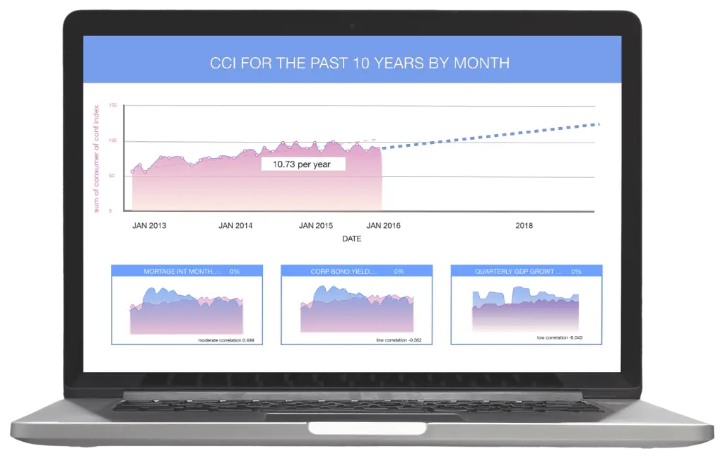
Let's say you want to look at the correlation of multiple variable on the Consumer Confidence Index (CCI). Rather than sending this request to the data analytics team. You can use IDA in much the same way you use search engines. Once the underlying data sets are loaded. You simply ask IDA for the information you want using natural language - typing or speaking it.

In this case. We want to see data for the CCI for the past 10 years.

With the data plotted. We can choose the data range to work with. Do a simple regression. And go out a few years.

We can then calculate the correlation between CCI and various factors. Such as mortgage interest rates. Corporate yield bonds. Quarterly GFP growth. Home supply. Inflation. Or any other factor in the data set.

NOTE: Line graphs at bottom will be replaced with scatter plots.

This produces a prediction for future periods based on the underlying variables, which you can see to the right. At the bottom. Those scatter diagrams can show you at a glance the correlation coefficient. You can that mortgage interest rates by month has a relationship to CCI (+0.499) while bond yield (•0.362) has a far less impact. This allows you to see at a glance which correlations are most impactful.

Dashboard and reports often show you numbers. But they don't always tell you what you want to know. Here’s where IDA gets to the good stuff and helps you discover key insights. Once you've established a relationship. You want to know the impact a variable has. So. what if mortgage interest rates suddenly went up 23%. Simply click on the box and slide the scale around the circle.

The predictive results show at the top.

As we know. However. Things are rarely static. Especially with economic conditions. SO. what happens when other variables change as well. What if we increased the amount of cash in the economy through changing corporate bond yields?

By adjusting the corporate bond yield. You can run multi-variate analysis with ease. You can also do deeper dives into any variable from the same screen. You might want to further break down mortgage rates by region or bank. As mortgage rates follow, the Federal Reserve's short-term interest rates and mortgage-backed securities. You can drill down even deeper to 100k at the leading indicators that trigger changes in these variables.

Such information can help you understand how these complex variables all work together without having to tie your IT or data analytics teams. Because IDA is so intuitive and easy to use. It's simple to add. Delete. Or merge data to continue your journey of discovery.

Get Intuitive, Interactive Business Intelligence

IDA lets you create customized queries and reports on the fly. Interact with the data in real-time. And leverage dynamic predictive modeling and correlation analysis to reveal deeper insights. Interactive and responsive to voice commands, clicks, swipe, and typing, IDA enables anyone to hone in on data and discover the true business intelligence that leads to actionable insights.

Want to see IDA in action? Schedule a demo now.